Skip to content

Work / Case Study

iTaleSoWell

A home for Aniken D. Robinson's dark short fiction, built and hosted by VTS. A masked host presents the programme; twenty tales sit behind him with cover art, a proper reader and a downloadable ePub apiece — and the reader who likes one finally has a way to find the next.

The iTaleSoWell landing page — a darkened cinema seen from the back row, a cursed reel playing on the screen, and the marquee below it

20

tales, each with cover art and an ePub

21,353

words — from 274 to 2,485 apiece

0

words retyped — the site harvests them

4 min

median read, timed from the prose itself

The problem

Aniken D. Robinson writes dark short fiction, and writes it fast — a new tale most weeks, running from a two-minute dare you read in the dark to an eleven-minute deep-space slow burn. Under the name iTaleSoWell he had built a real body of work in a matter of months.

It was scattered across five houses that don't talk to each other. Prose on Wattpad. A single on Kindle. Episodes on YouTube and TikTok. Behind-the-curtain posts on Instagram. Every one of those platforms owns the relationship with the reader, decides who sees the next thing, and can change its mind on a Tuesday. A reader who finished one tale and wanted another had nowhere obvious to go.

What was missing wasn't marketing. It was an address of his own — one place that holds all of it, presents it the way he'd present it, and turns a reader who liked something into a reader who comes back.

Three load-bearing ideas

The host is the architecture

iTaleSoWell — a masked host with a crypt of tales — isn't a skin over a blog. He decides what the pages are called (Now Showing, The Library, Your Host), what a reader is doing when they arrive (taking a seat), and what a tale is when it opens (a feature). Give a writer a theme and you get decoration. Give them a character and you get an information architecture that writes itself.

A short story is sold by its first line

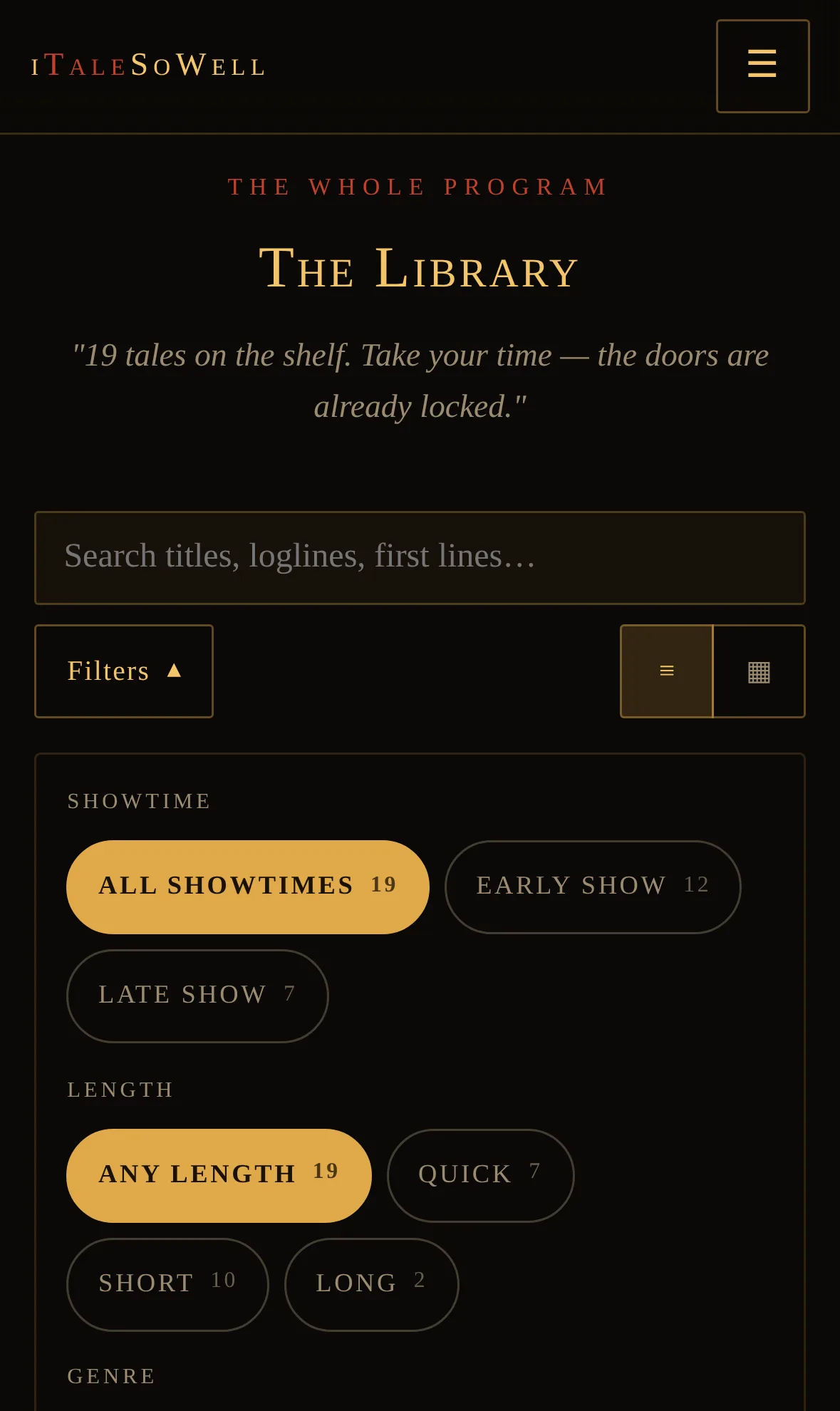
A wall of cover art is a novel-and-movie idiom, and it fails a thousand-word tale — the art can't carry what the prose can. So the library leads with each tale's actual opening paragraph, pulled from the story rather than written as a blurb. The poster grid is still there as a toggle, for when the art is the point.

Showtimes, not age gates

The catalogue splits into an Early Show and a Late Show, read off the content rating each tale already carries. It's theatre language on purpose. The readers most likely to want the milder shelf are the ones a label like "kids" would condescend to — and a surface that declares itself child-directed invites a body of regulation nobody here needs.

The site

Cover art and prose are the author's own.

The Now Showing section of iTaleSoWell: eight poster cards, each with cover art, rating, runtime and a one-line loglineThe Library page: filter rail for showtime, length and genre beside a list of tales, each showing cover, metadata and its opening paragraphA tale open in the reader: warm serif prose on near-black, a chapter heading, and a toolbar with scroll or page mode, chapters, text size and ePub downloadThe Never Miss a Showing section: a single email field promising one short tale a week, with a one-click way out
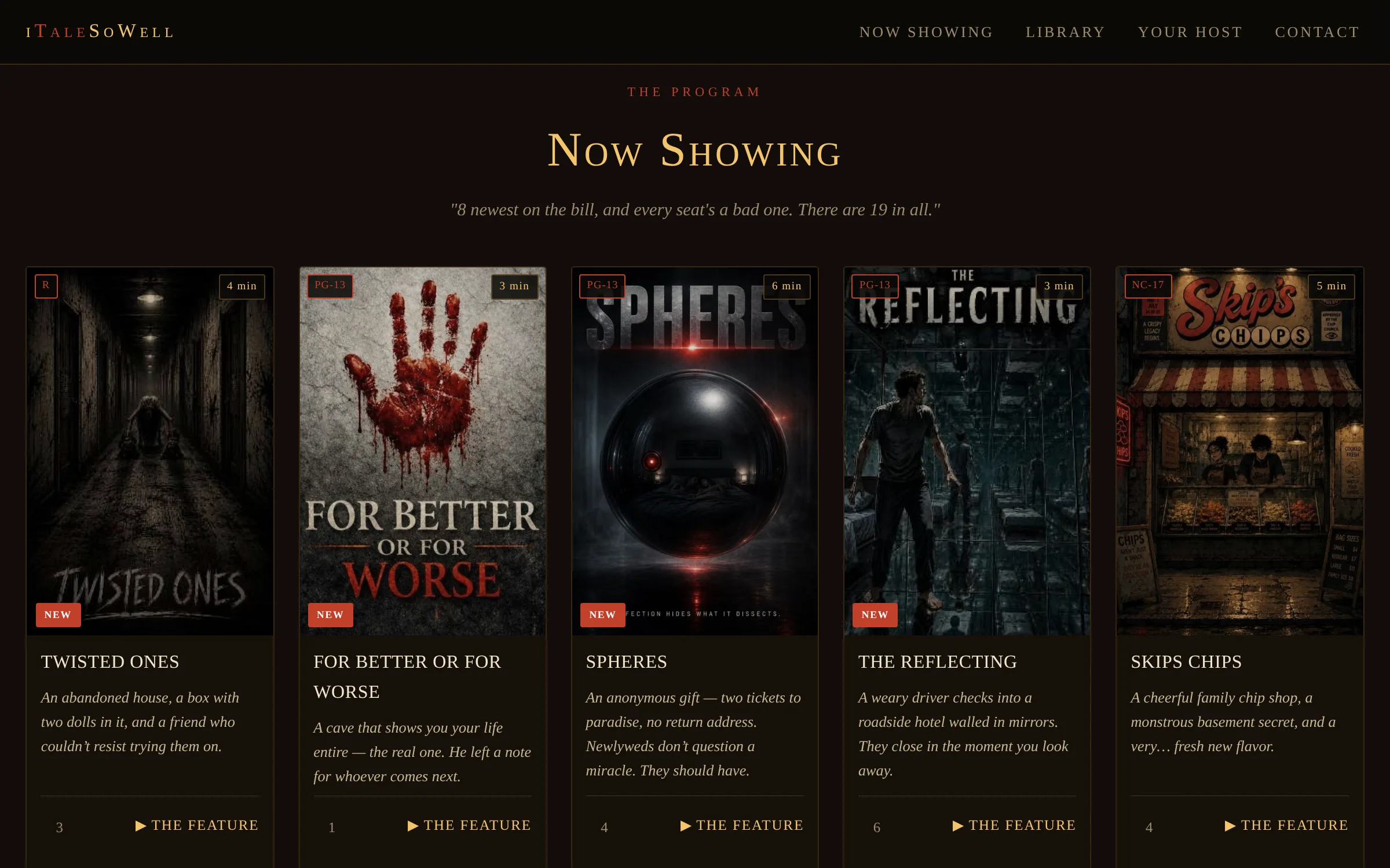
The Now Showing section of iTaleSoWell: eight poster cards, each with cover art, rating, runtime and a one-line logline

Now Showing — the newest eight, each with its rating, runtime and the logline that has to sell it.

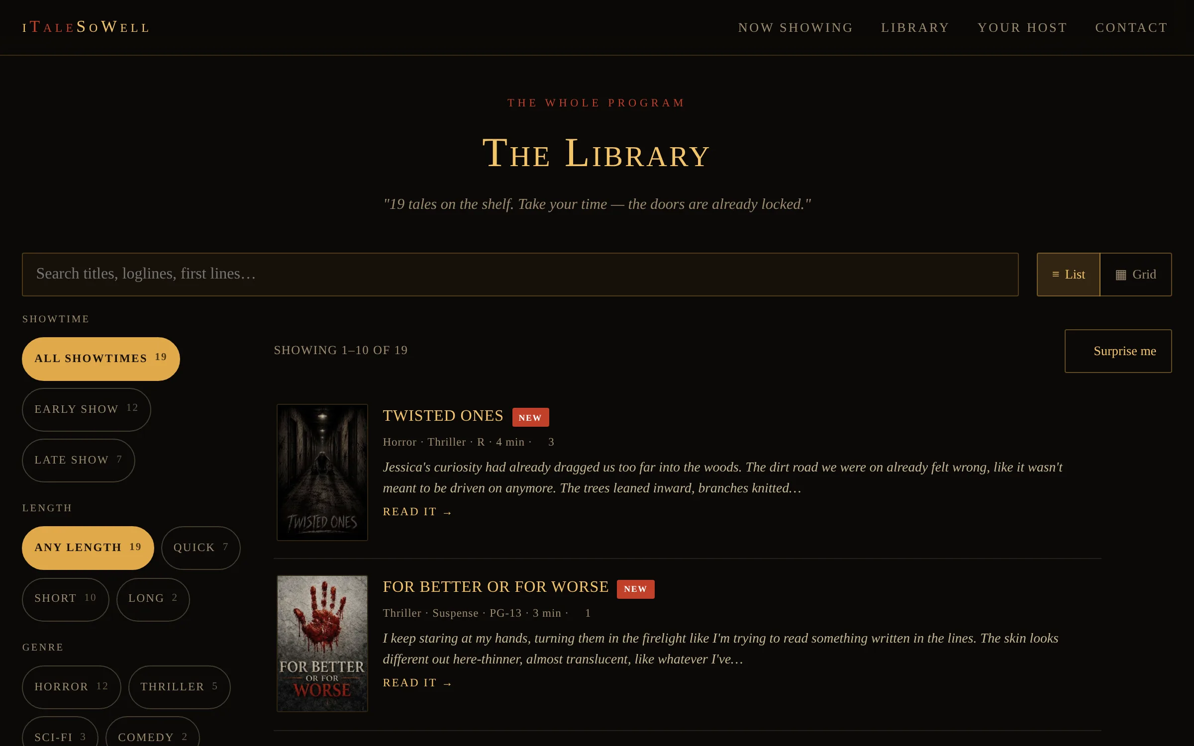
The Library page: filter rail for showtime, length and genre beside a list of tales, each showing cover, metadata and its opening paragraph

The Library — filters live in a rail; every tale leads with its own first paragraph rather than a blurb.

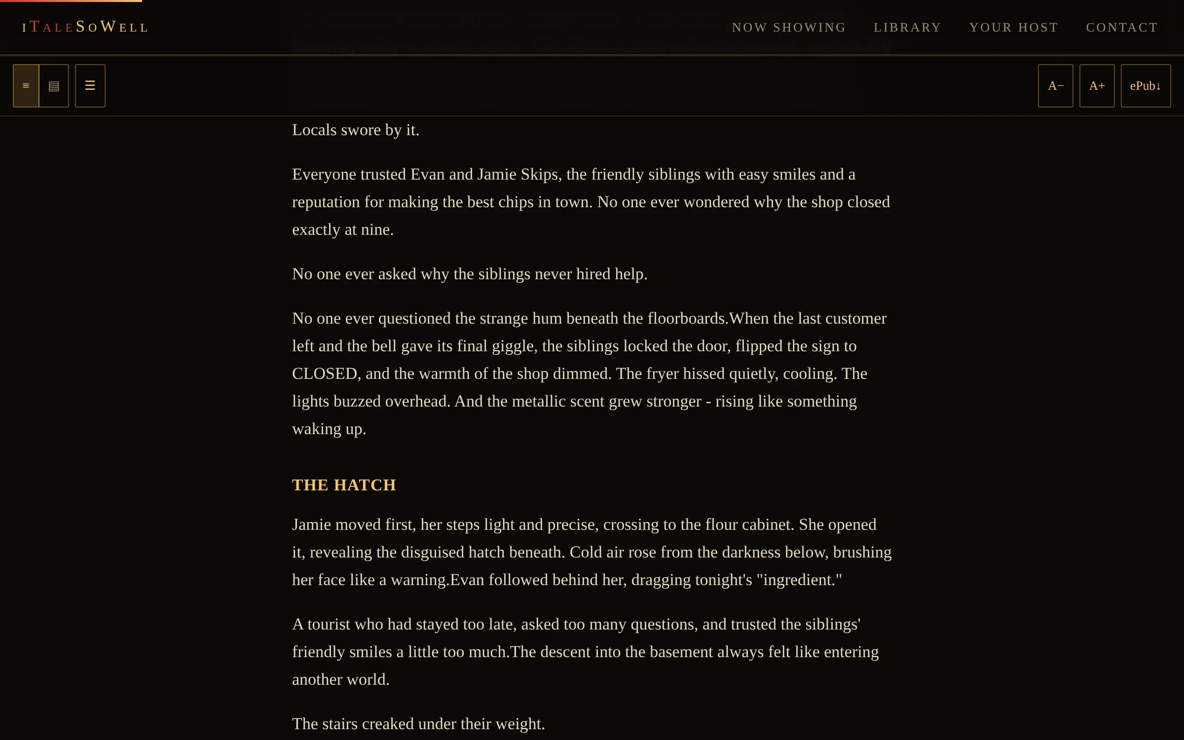
A tale open in the reader: warm serif prose on near-black, a chapter heading, and a toolbar with scroll or page mode, chapters, text size and ePub download

The reader — scroll or page-turns, a chapter index, text size, and an ePub for every tale.

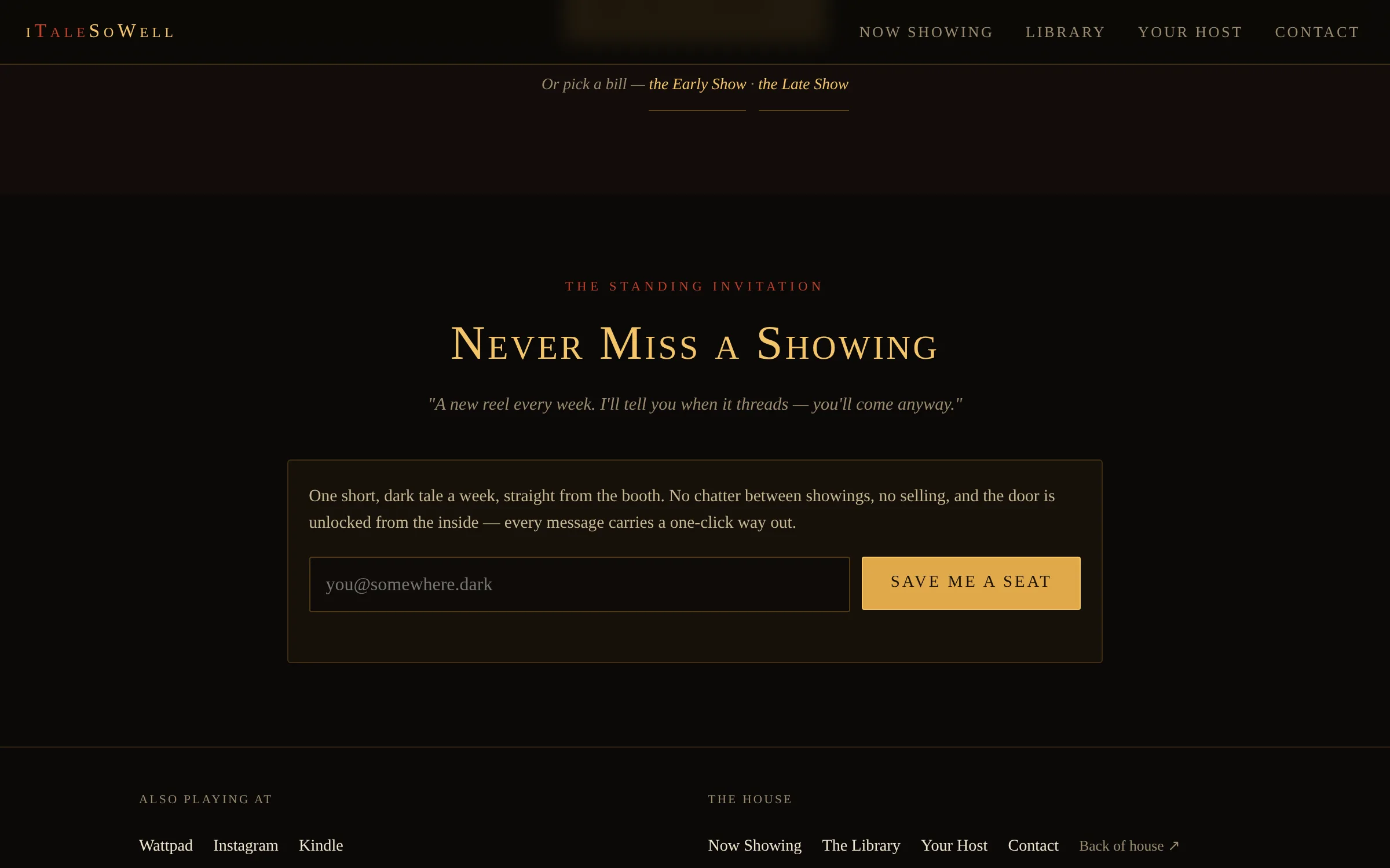
The Never Miss a Showing section: a single email field promising one short tale a week, with a one-click way out

The one conversion on the front page — an audience the author owns, rather than one a platform lends him.

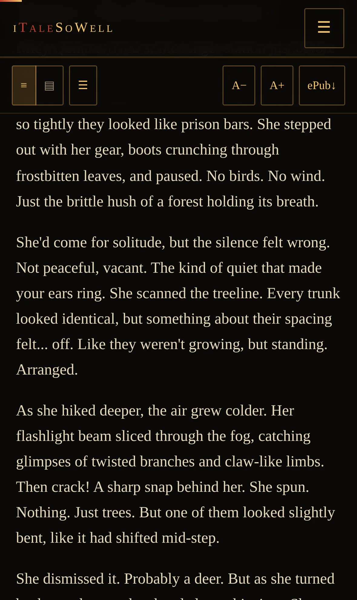
A tale being read on a phone: serif prose at a comfortable measure with a compact sticky toolbar

Reading on a phone — a capped measure, a sticky toolbar, and a progress bar that survives a font change.

The Library on a phone with the filter panel opened, showing showtime, length and genre chips with counts

The same filters on a phone — folded behind one control, so the first tale is half a screen away.

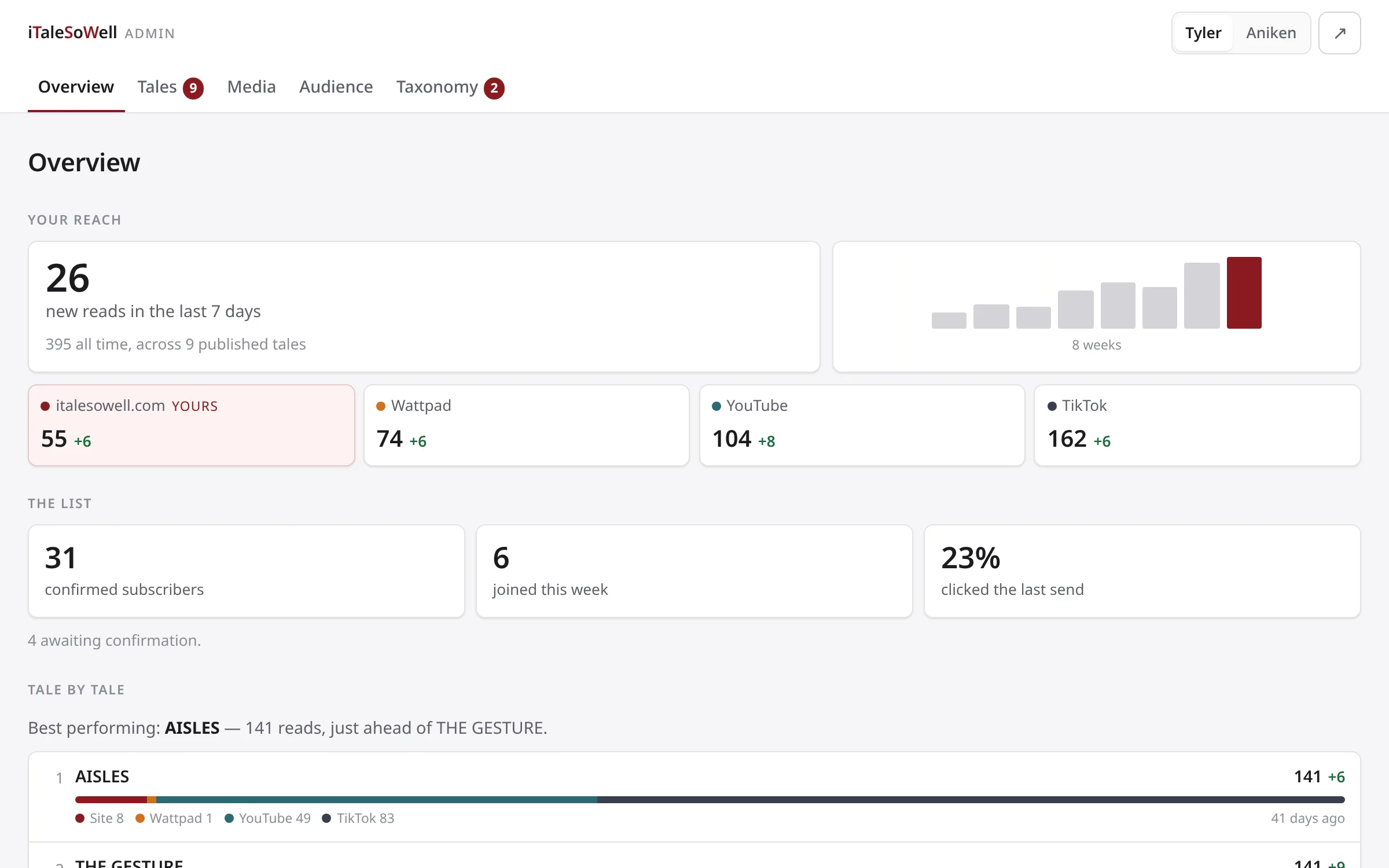
The admin overview: a weekly reads figure with an eight-week sparkline, four channel cards with the author's own site marked as his, subscriber counts, and a ranked list of tales with stacked bars showing where each one was read

The overview ranks rather than totals, and reports movement in people — at these numbers a percentage would be theatre.

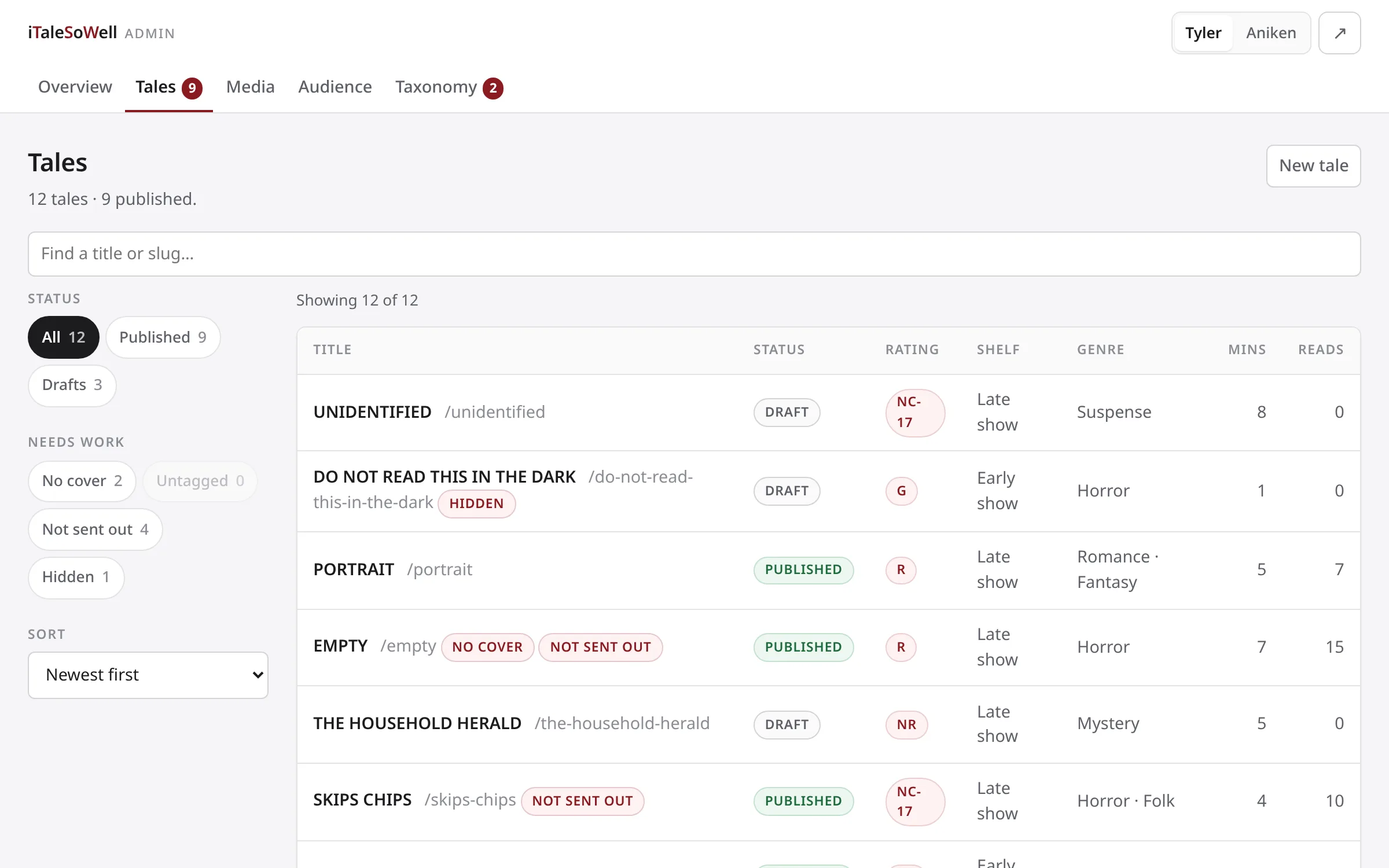
The admin tales list: a filter rail with status and needs-work chips carrying counts, beside a table of tales showing status, rating, shelf, genre, runtime and reads

One list, no tabs. Each chip's number is what you would get by clicking it, so a dead end is greyed before it wastes a tap.

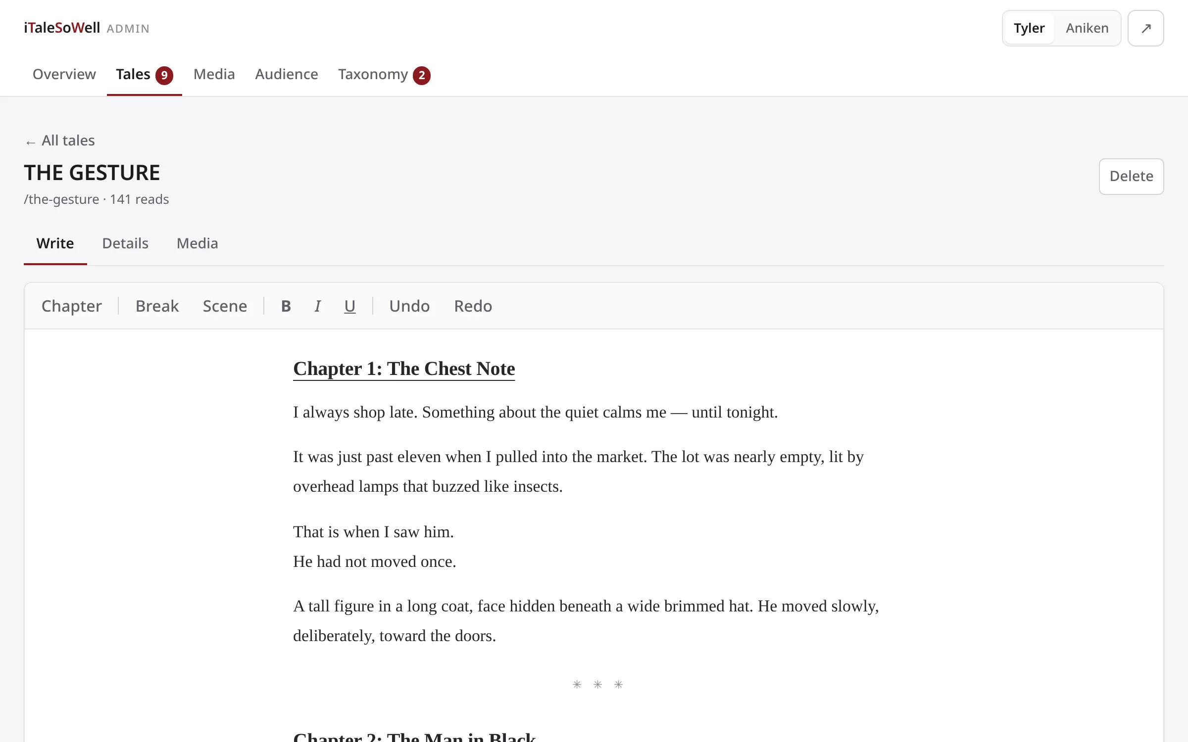
The tale editor: a toolbar reading Chapter, Break, Scene, then bold, italic and underline, above serif manuscript text with a chapter heading and a scene divider

The editor speaks the writer's vocabulary — Chapter, Break, Scene — not a word processor's.

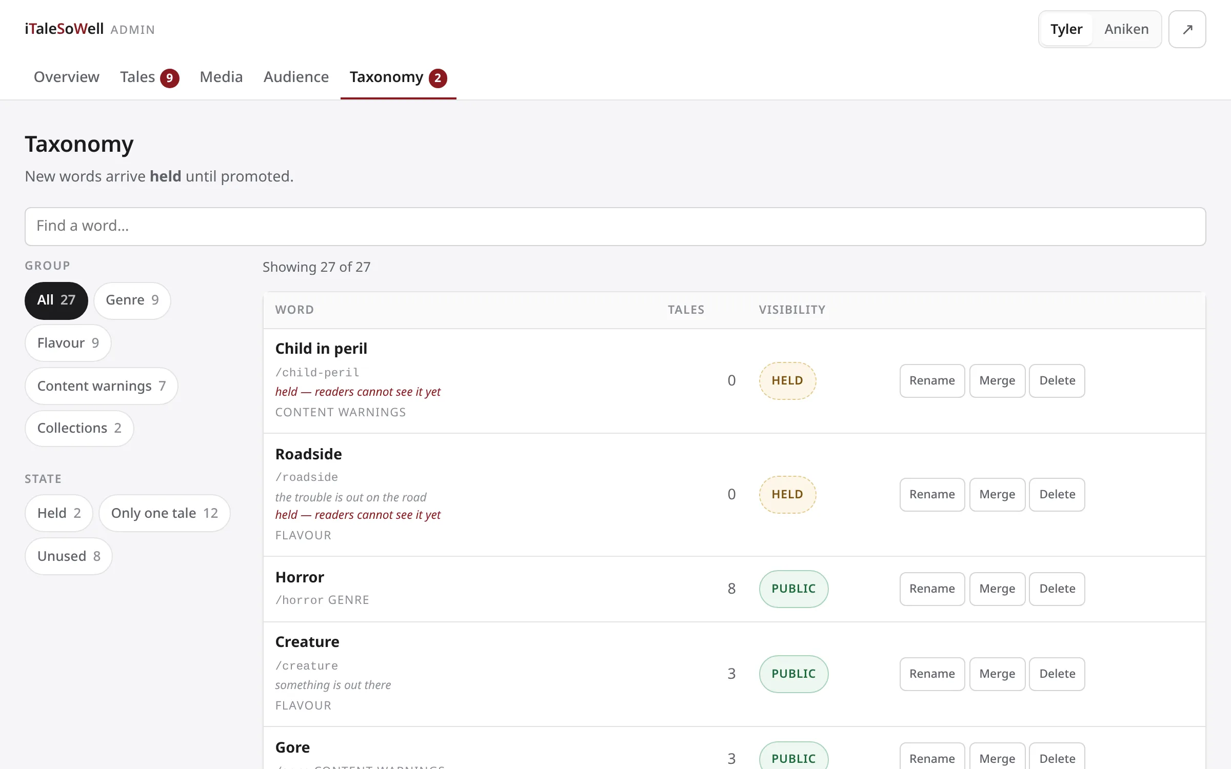
The taxonomy page: words grouped by genre, flavour, content warnings and collections, each showing how many tales use it and whether it is public or held

New words arrive held — usable the moment they are invented, invisible to readers until promoted.

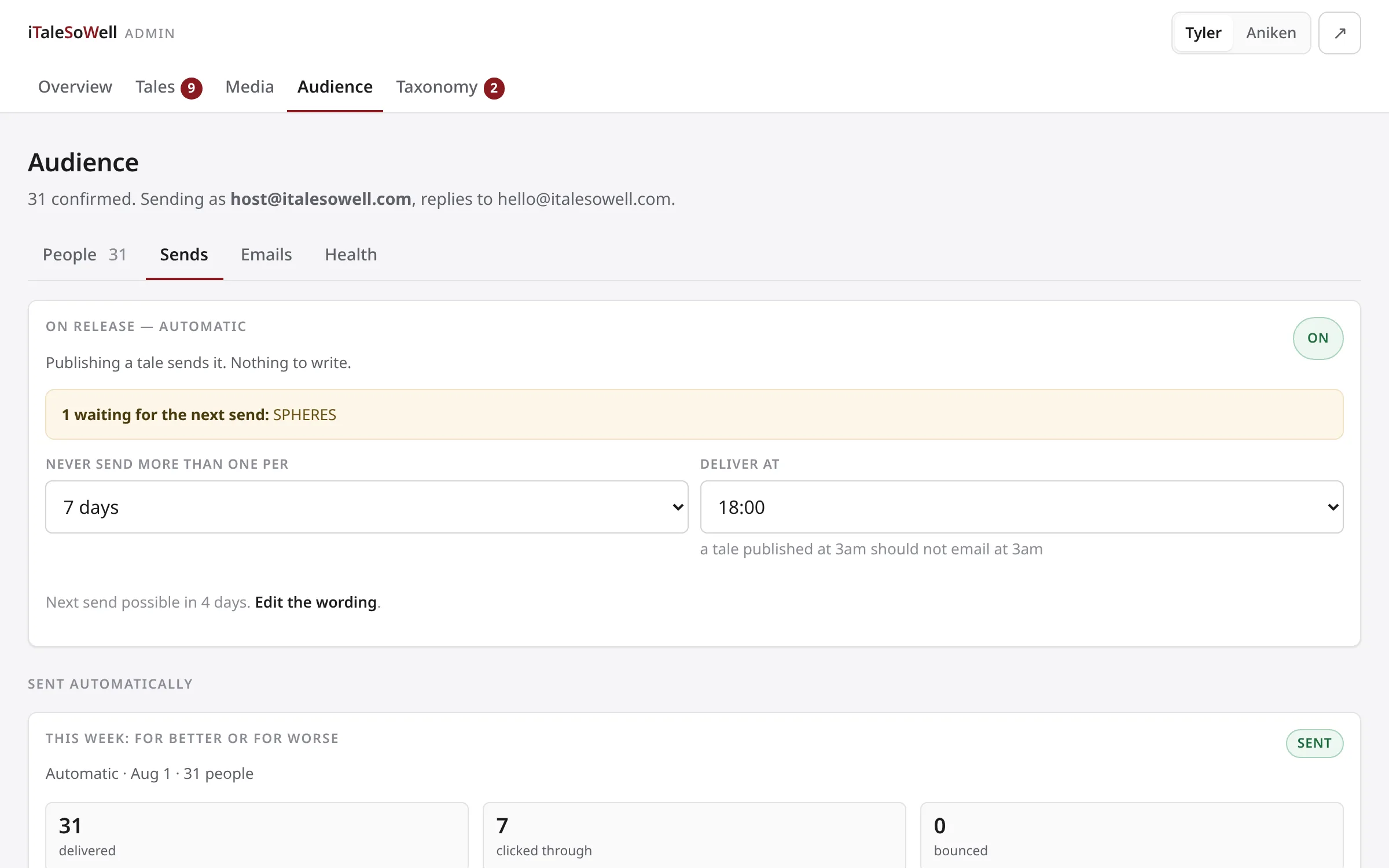
The sends tab: an automatic on-release send toggled on, a frequency cap of one per seven days, a delivery hour, and the record of a broadcast with delivered, clicked and bounced counts

Publishing a tale is the send. A frequency cap and a delivery hour keep an automatic list from behaving like a bot.

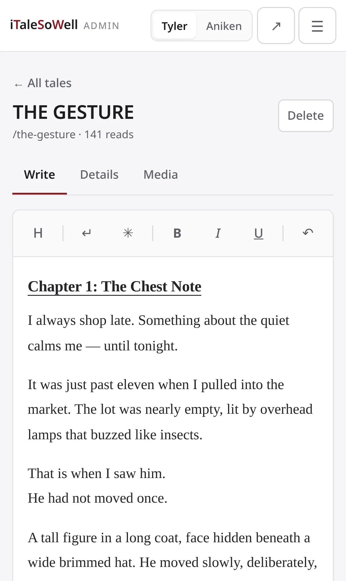
The same tale editor on a phone: the toolbar collapsed to single-character icons above the manuscript text

The same editor on the device he actually writes on — the toolbar collapses to icons rather than wrapping.

Written on a phone, read on a phone

The author writes on an Android handset, and his readers arrive on phones. So the reader was built there first: a measure capped at about ninety characters so the eye doesn't lose its place on the return, a chapter index built from the headings he already types, and text size that sticks between visits. Reading position is stored as a fraction rather than a page number — the only form that survives changing the font, rotating the phone, or switching between scrolling and page-turns.

Every tale carries a downloadable ePub, generated from the same prose the page shows. Nobody assembles them by hand, so there is no version of the site where the download and the page disagree.

A tale being read on a phone: serif prose at a comfortable measure with a compact sticky toolbarThe Library on a phone with the filter panel opened, showing showtime, length and genre chips with counts

The half the reader never sees

A storefront is the easy half. The harder half is the room behind it, where the author files a tale, names what it is, and decides who hears about it — because that is the part he touches every week for years.

It is built for the numbers he actually has. The overview ranks, rather than totals, because “which of my tales is working” is real information at a hundred reads and the hundred is not, and it reports movement in people rather than percent, because at this size “up fifty percent” means two readers. His own site sits beside the platforms as one channel among four — the one marked as his.

Vocabulary works the way writers do. A new tag arrives held: usable the moment he invents it mid-sentence, invisible to readers until he promotes it. Forcing an author to stop and administer a taxonomy gets the taxonomy abandoned; publishing every passing word as a public category gets it filled with noise. Held is neither.

And the list runs itself without behaving like a bot. Publishing a taleis the send, so there is no second thing to remember, but it is capped at one message a week and delivered at a civil hour, on the principle that a tale published at three in the morning should not email anyone at three in the morning. Bounces and complaints suppress themselves against the thresholds the mail provider actually enforces.

Two people sign in, and they are not equals. Approving a piece of artwork is the author's alone; the developer can keep house but cannot bless the work. Even the notification badges respect it — a count of decisions waiting on Aniken never appears on my screen, because a nag about work you are not permitted to do is just noise.

The back office is shown with sample data at realistic volume — a dashboard has to be designed against the numbers it will hold, not against an empty state.

The admin overview: a weekly reads figure with an eight-week sparkline, four channel cards with the author's own site marked as his, subscriber counts, and a ranked list of tales with stacked bars showing where each one was readThe admin tales list: a filter rail with status and needs-work chips carrying counts, beside a table of tales showing status, rating, shelf, genre, runtime and readsThe tale editor: a toolbar reading Chapter, Break, Scene, then bold, italic and underline, above serif manuscript text with a chapter heading and a scene dividerThe taxonomy page: words grouped by genre, flavour, content warnings and collections, each showing how many tales use it and whether it is public or heldThe sends tab: an automatic on-release send toggled on, a frequency cap of one per seven days, a delivery hour, and the record of a broadcast with delivered, clicked and bounced countsThe same tale editor on a phone: the toolbar collapsed to single-character icons above the manuscript text

Small enough to outlive its dependencies

A site for an author's life's work should still open in ten years. This one is hand-written HTML, CSS and JavaScript with no framework and no build step — there is nothing in it to rot. What automation exists sits outside the site: a job that reads the author's Wattpad and builds the mechanical parts of a new tale, and a deploy that is one fast-forward pull.

Site

Hand-written HTML, CSS and JavaScript — no framework, no build step, no dependencies to age out from under it

Reading

Scroll or CSS-column page-turns, chapter index derived from the author's own headings, position stored as a fraction so it survives font changes and rotation

Harvest

A Python job reads the author's Wattpad, builds the tale text, cover, ePub and reading time, and opens a pull request for the parts that need a person

Media

Covers and ePubs served from a store outside the repository — binaries never enter git history, where they cannot be removed

Deploy

A fast-forward git pull into the web root, served by Apache with brotli and immutable asset caching

Mail

Double opt-in list on the author's own domain, sending through SES with DKIM alignment

Automate the mechanical, never the voice

When a new tale appears, the pipeline does the parts with a right answer: the text, the cover, the ePub, the reading time computed from the word count. It then stops and asks. The content rating, the logline on the poster, and the host's sign-off after the last line are the author's — they are judgements about his own work, and a machine guessing at them would be worse than a machine not trying.

The same line runs through the mailing list. It is double opt-in on his own domain, there is no way to add an address by hand, and every message carries a one-click way out. An audience nobody can throttle, built one person at a time, is the only asset in this business that compounds.

A place of your own beats a page on someone else's

If you make something and it lives scattered across platforms that own your audience, the fix is an address you control. Let's talk about what yours should be.